Featured WorkPika: AI Companion
Pika is a design project focused on building a scalable mobile design system and applying it through a modern AI companion experience that demonstrates strong UI execution, mobile interaction design, and design language system thinking.
Role: Lead Designer — Concept & Experience Design
Year: 2026
Problem
Establish a scalable design language system
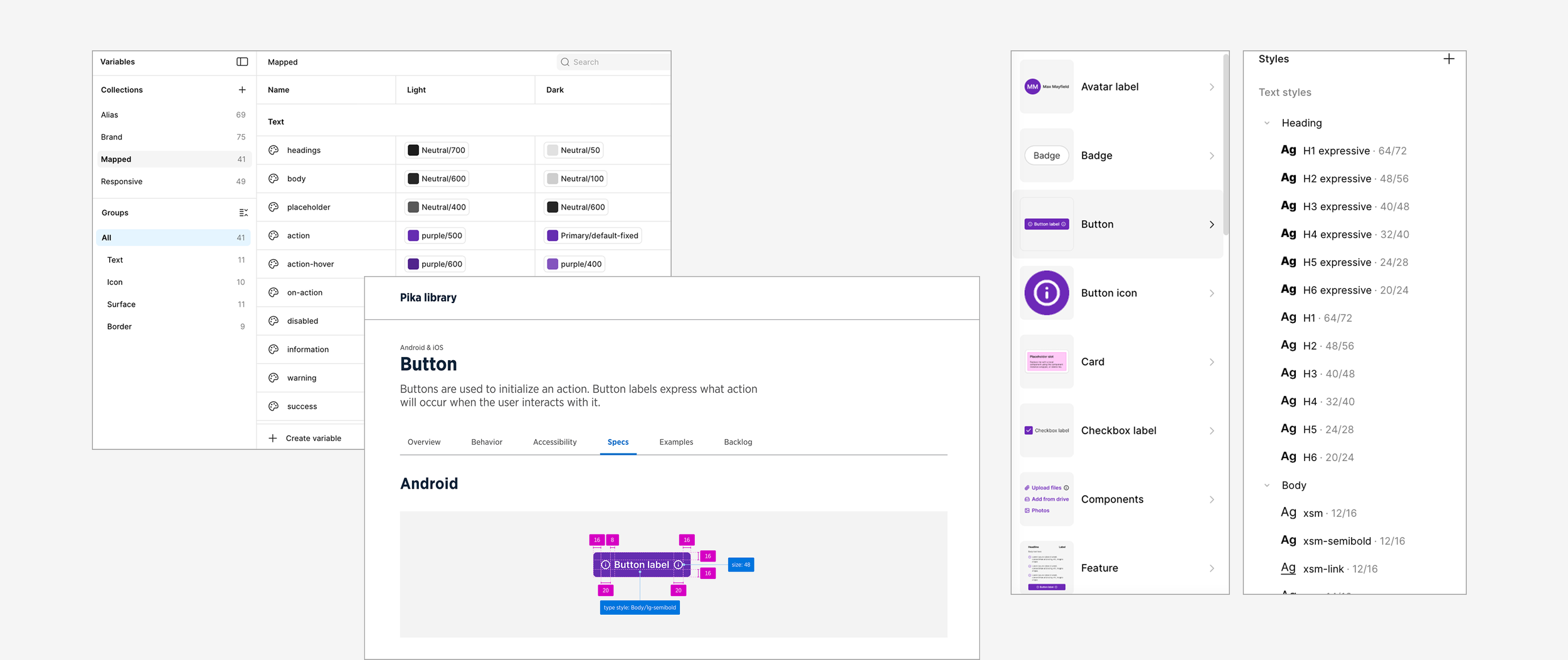
Define the atomic foundations, tokens, typography, spacing, and color, to support a consistent mobile UI.
Demonstrate consistency across a real product surface
Show how a design system maintains clarity, hierarchy, and usability throughout the full app.
Design an end-to-end mobile assistant experience
Apply the system through a complete AI companion flow, from onboarding to chat, navigation, and plans.
Align system design with Pika’s brand identity
Define a consistent look and feel that supports trust, warmth, and clarity throughout the experience.
Build a reusable component library
Create flexible components and interaction patterns that can be applied across screens instead of designing one-offs.
Master Figma variables for systems
Establish best practices in applying variables to effectively create, organize, and scale across components and future system updates.
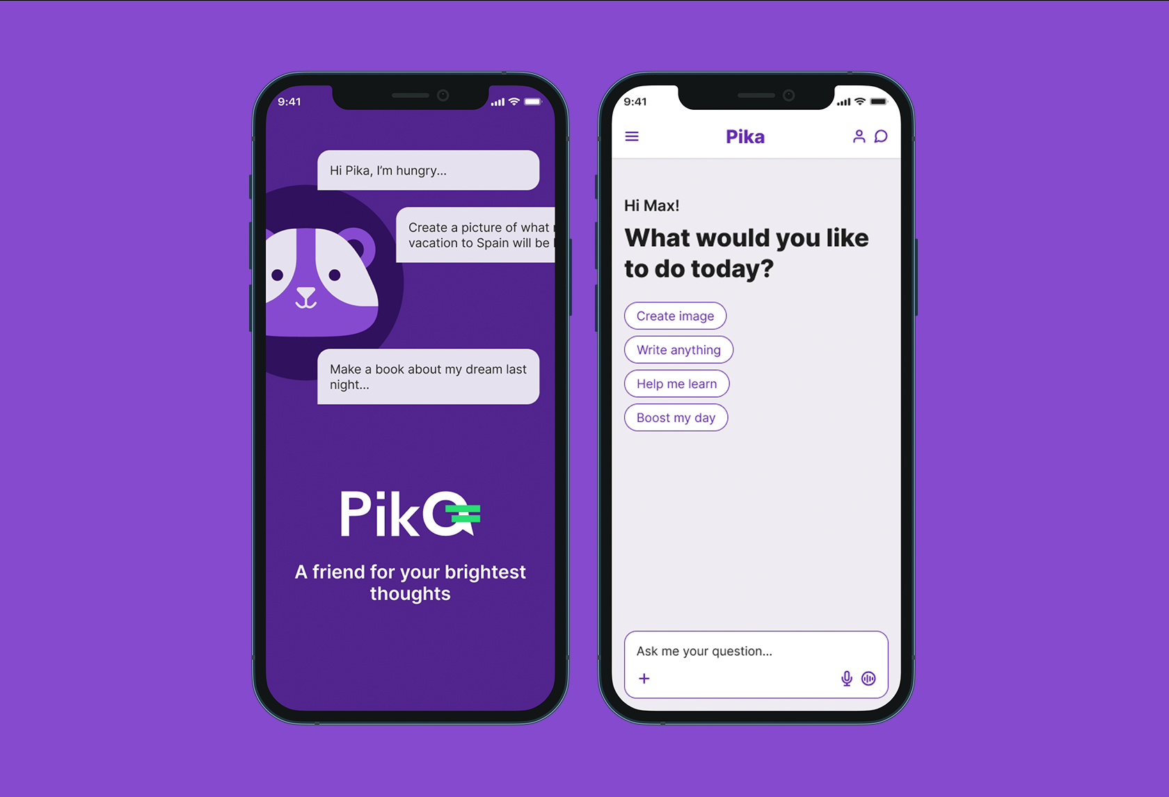
The Experience
System-Driven AI Chat Interface
This project explores how strong design system principles can elevate conversational AI. Every element, from message bubbles and response states to prompts and interaction patterns, was built using reusable components and variables to ensure flexibility and scalability. The goal was to create an interface that feels lightweight and intuitive, while maintaining the structural integrity needed to support future features and expansion.
Approach
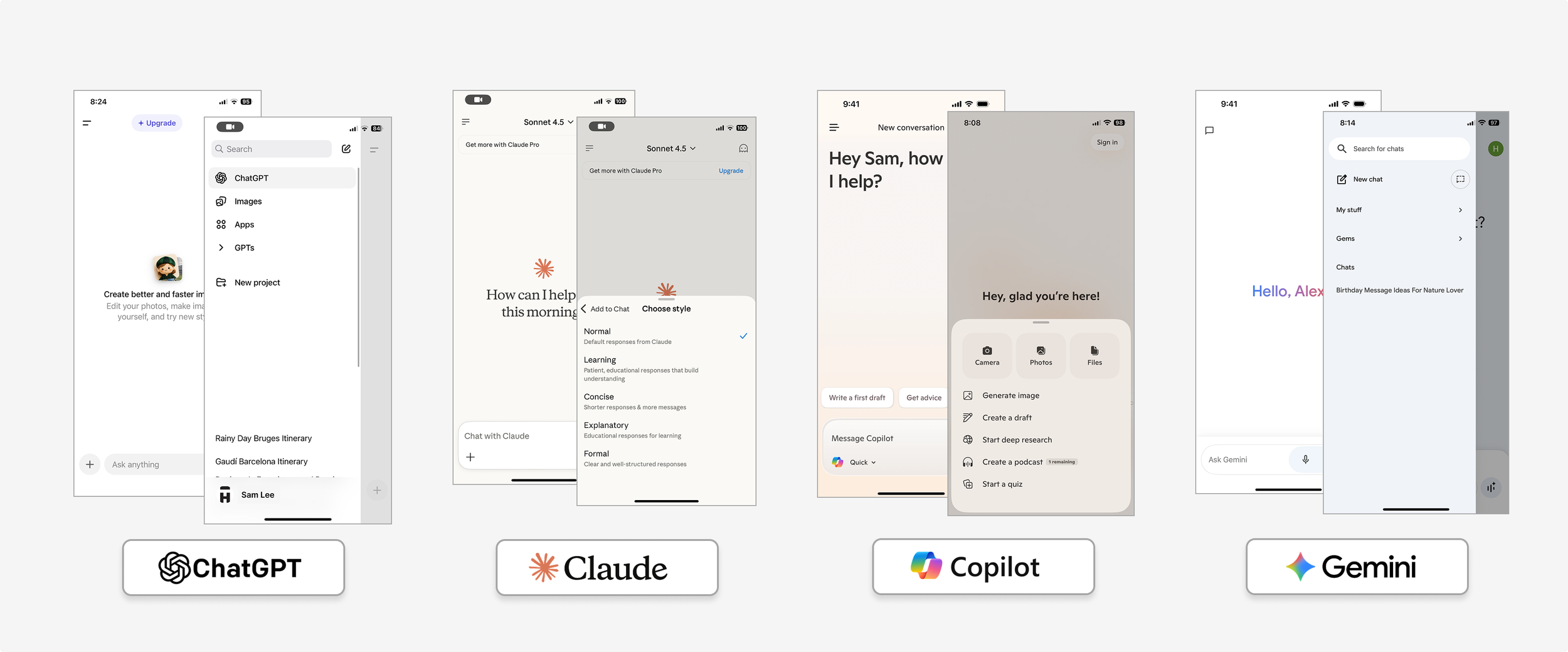
Competitor Analysis
Explored familiar chat app behaviors, UI conventions, and interaction models to define a clear foundation for an AI assistant experience.
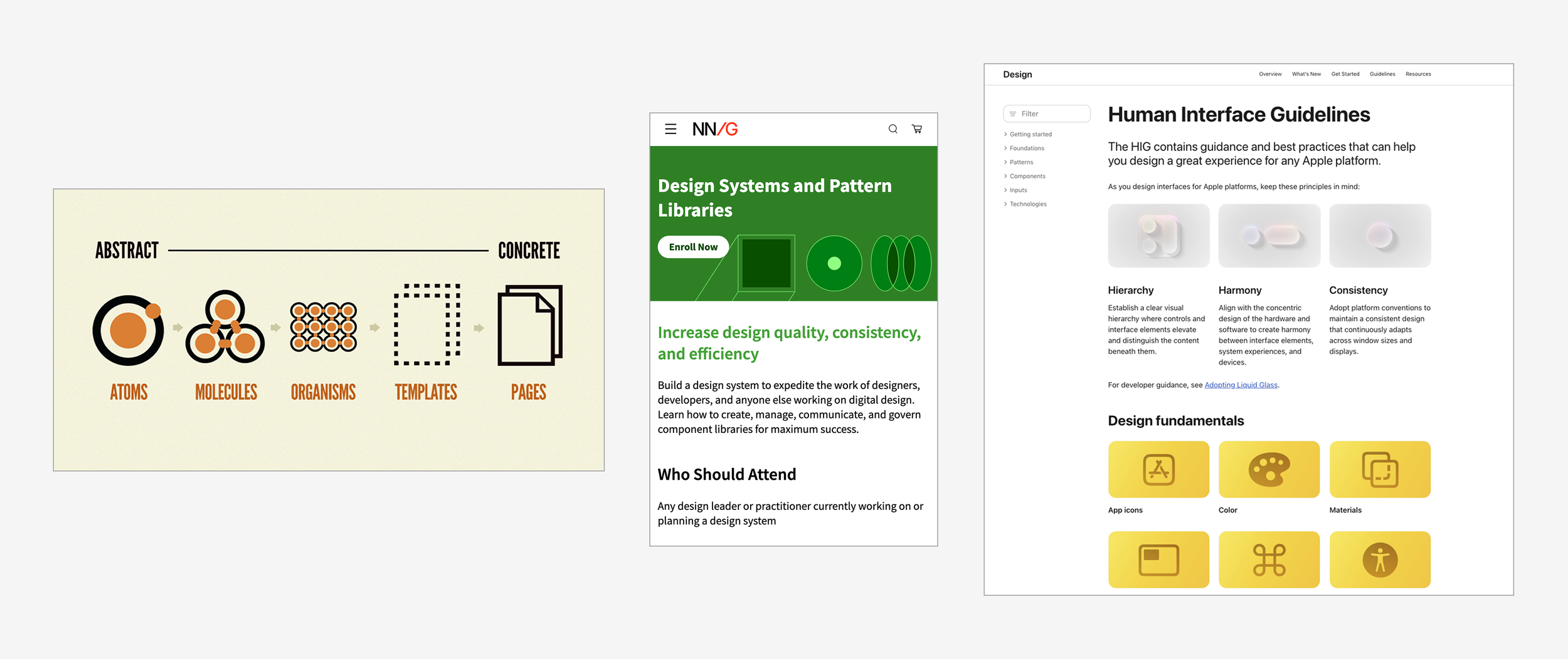
Design System learning
Deepening understanding of design systems in applying variables, tokens, and reusable components in Figma.
Foundations
The foundational layer of the system — including design tokens, variables, typography styles, and core components — built to ensure consistency, scalability, and efficiency across the product. Every element is structured to support flexibility while maintaining visual cohesion.
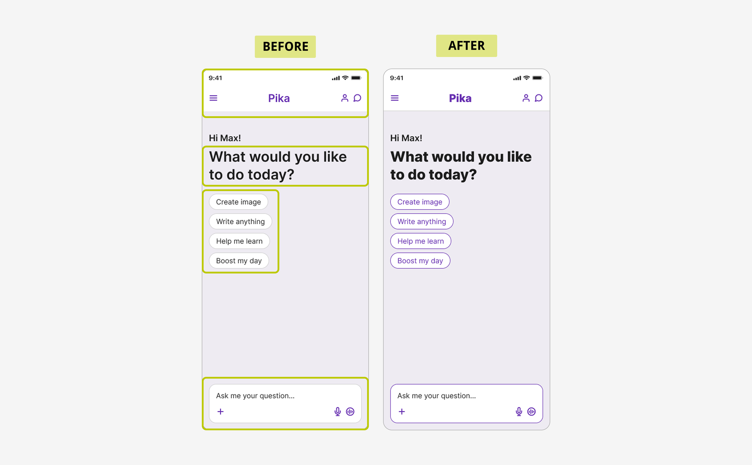
Iteration & System evolution
To improve emphasis and clarity, we evolved the system by introducing a bolder, more expressive heading type scale and some component elements.
Expressive Headers
Badges
Prompt field
This iteration reinforced a core principle of the system: it must remain adaptable and scalable, evolving alongside real-world product needs.